Hayward and Saatchi Gallery Visit
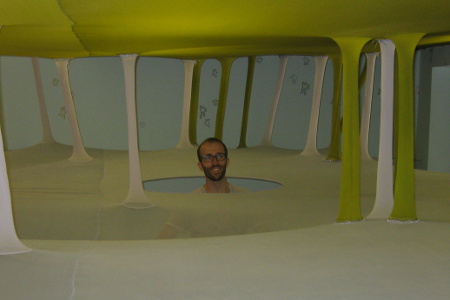
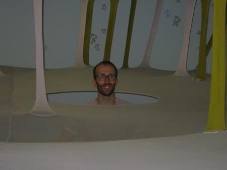
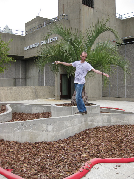
This is a picture of me in a very strange place:
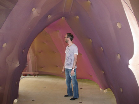
It is actually a part of Ernesto Neto’s The Edges Of The World exhibition at the Hayward Gallery. If you follow my blog you’ll know that I like the Hayward Gallery and have featured it here before. (here, here and here)
I took plenty more pictures of weird and wonderful artworks …
These are all from the same exhibition, taken by my mother:
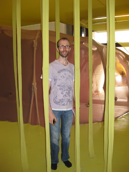
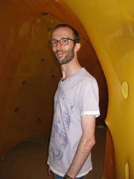
This is me interacting with (ie walking on) Walking To The Future, part of the same exhibition:
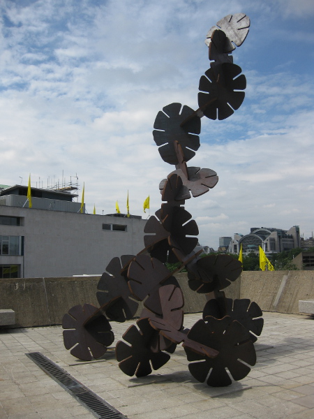
This is a sculpture made out of thick steel click together discs. It was apparently designed to look unstable and dangerous - clearly something the gang of children climbing on it weren’t too bothered by.
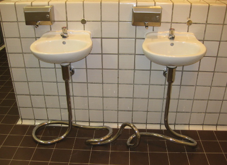
Paired with the Neto exhibition on the ground floor of the gallery was The New Decor. Photography wasn’t allowed, but I couldn’t resist sneaking this picture of a fully functional art installation in the men’s bathroom:
Next up we went to the Saatchi Gallery, just recently donated to the nation by its owner, Charles Saatchi.
On a previous visit to the gallery when I’d only managed to fit in a very brief stroll around the ground floor I hadn’t been especially taken by many of the works on display. On a second lengthier visit, however, I found a lot more to appreciate, though notably none of the pictures I chose to show here were taken on the ground floor.
I particularly liked Pixelweave by Rupert Norfolk, although it appears to have flattened out a little since the official photo (here) was taken:
![]()
Like a number of the works shown here, a picture doesn’t really do it justice. It initially looks like a rumpled up old carpet but closer inspection shows that the folds are printed into the texture. Staring at it for too long gave me a strange feeling that I was about to lose my balance as my visual perceptions were messed with.
Balanced on two chairs is Madame Blavatsky. Or, at least, a model of Ms Blavatsky, whoever she may be:
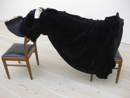
Not an artwork I especially liked but curious enough to warrant a photo anyway.
I did like Sigrid Holmwood’s luminous paintings, though. Perhaps I’m just a sucker for new ideas, but I liked them anyway! The pictures don’t really reproduce the bright luminous colours properly.
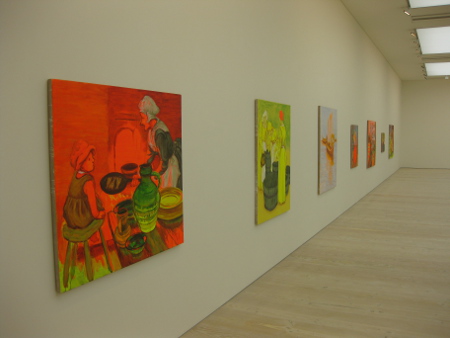
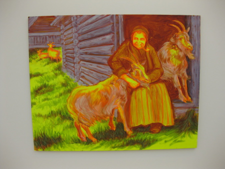
Other works I was taken by include this tower built out of old loudspeakers, and the little huddle of people staring into the corner in one of the other rooms.
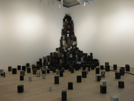
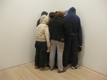
Finally, I include this picture of Richard Wilson’s 20:50 site specific oil installation. Again, a picture isn’t doing this work justice as it is one you need to experience and work out for yourself:
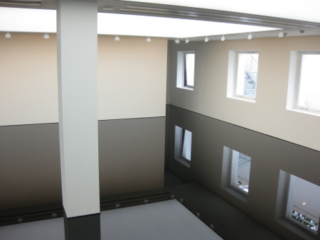
There are some more impressive professional pictures of this work here.

