Friends Network
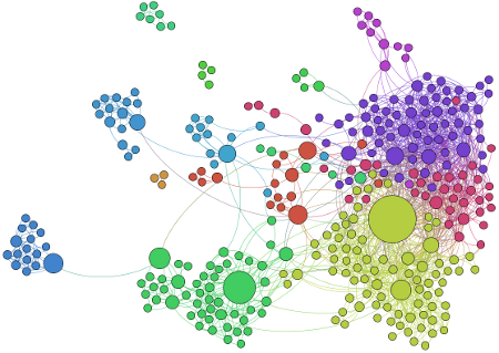
The picture above shows a graph of how my facebook friends inter-relate. It is entirely computer-generated, including all colours, sizes and positioning. Read on to find exactly what information the picture reveals and how you can make your own.
I created the graph using two excellent pieces of free software: netvizz and Gephi. The former to extract data from facebook and the latter to convert that data to a visual form. I also wrote a small script in Python to merge together data for the four friends I have who have two accounts each. This isn’t necessary but helps make the relationships a lot clearer.
There are some simplified instructions for making your own graph here.
The graph (mathematical definition) shows the connections between my friends. Note that name labels have been removed to protect the innocent.
There is a circle for each of my friends with a line drawn between any pair of those friends who know eachother. I removed the 35 or so friends in my network who don’t know any of my other friends and hence don’t have any lines connecting them on the diagram.
The relative size of the circle illustrates that person’s Betweenness Centrality. This is a measure of how well-connected that person is amongst my friends. It isn’t necessarily a measure of how popular that person is, rather how they connect disparate groups of people. Looking at these numbers lead me to some suprising revelations of friends from apparently different parts of my social circle knowing eachother when I wouldn’t have expected them to.
This becomes more apparent when you consider the circle colours. These are chosen automatically by an algorithm that calculates Modularity Class, which measures how well a network decomposes into smaller communities. It is quite uncanny to see how the software has managed to separate Rock Choir members, Rockaoke fans, family, Aikido practitioners, various social groups and personal development fans, to name but a few of the various groups of people I hang around with.
People with higher Betweenness Centrality aren’t exclusively the ones I have a lot of friends in common with but are also the ones connecting the separately coloured groups.
All sorts of calculations are possible given the data. One of my favourites was Network Diameter. Not only did this tell me that the average distance between my friends is 3.62 (See Kevin Bacon Number, now available on Google, or more scientifically, Erdos Number for more info) but that there are 11 friendship links between my two most unrelated friends. Somewhat ironically it turns out that the two of my friends who in theory should know each other the least are both people I know to share a very similar hobby.
My research was inspired by the Networked Life course at http://www.coursera.org on which I am currently enrolled. Thank you to all of the people involved in the creation of the excellent free resources I have used to study and to produce this article.